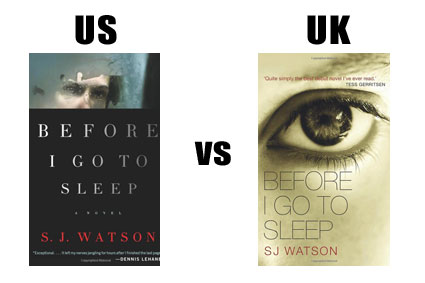
US vs UK book cover design
The other day I just happened upon the US book jacket for Stieg Larsson’s Girl with the Dragon Tattoo online and the design immediately shifted my perception of the novel.
After abandoning GwtDT at the 200 page mark (I know – it’s really supposed to pick up from page 201 onwards, but really…) I have always been firmly in the I don’t get it/emperor’s new clothes camp. But that literary fiction style cover almost got me reconsidering my opinion.
The US version is classy – especially compared to the slightly low rent UK version. So that got me thinking – are US designs better (very subjective I know) right across the board? Does the fact that American design, over the last 60 years at least, is so damn cool, mean that US book jacket design trumps British graphics every time?
Here are some more examples. I’ve tried to compare like with like – ie hardcover vs hardcover, paperback vs paperback.
Mmm. Not sure about this one. Train track features heavily in both – I’m guessing there’s some railway action involved in the plot… but the golden UK version featuring, like, actual people (and the guy has to be Jack Reacher) evokes much more of an emotional response. Dare I say it, but the blue US design looks a little amateurish.
US 1 – 1 UK
Next up, a crime novel with out and out literary pretensions – the protagonist is even a novelist for gawd’s sake.
 Not sure I can take to either of these two. The US one looks like it could have been knocked up in Powerpoint and the UK version, though the typeface is attractive (Trade Gothic Light, maybe?) it reminds me of the cover for Cut Short by Leigh Russell.
So the score still stands at 1-1.
Last up is Kate Atkinson’s most recent Jackson Brodie adventure.
What the what? Who’s the geezer under the umbrella? And if it’s Jackson, where’s the ruddy dog? I know it has been known to rain in Leeds, but as the weather doesn’t play a huge part in the plot, I’m not really seeing the relevance. And was the comic font strictly necessary? UK version wins hands down. Which means the final score is:
US 2 – 2 UK
As it should be – I do like a happy ending.
RETURN TO THE BLOG ARCHIVE<<


